
How to Evaluate Clinician Wellbeing Score: A Step‑by‑Step Guide
- Patricia Maris

- 3 hours ago
- 9 min read
Clinician burnout isn’t a mystery; you can see it in the numbers.
When you know a clinician’s wellbeing score, you spot risk before it erupts into sick days or turnover. That’s why learning how to evaluate clinician wellbeing score matters for every hospital, clinic, or solo practice.
Start by picking a proven questionnaire—like the Mini‑Z or Maslach Burnout Inventory. Collect responses anonymously, then plug the raw answers into the scoring sheet the tool provides. The sheet turns each answer into a numeric value, adds them up, and gives you a clear score ranging from low risk to high risk.
Next, compare the score to industry benchmarks. If a nurse’s score lands in the red zone, flag the unit for a quick check‑in. If a surgeon’s score sits in the green zone, note what’s working and share the practice.
Finally, turn the number into action. Draft a short plan: schedule a one‑on‑one, suggest a stress‑relief micro‑habit, or link the clinician to the e7D‑Wellness self‑assessment portal. A simple checklist keeps the process moving.
Need a step‑by‑step walkthrough? Check out How to Measure Clinician Wellbeing in Clinical Practice for templates and tips you can start using today.
Step 1: Define the Wellbeing Metrics
First thing you need is a clear picture of what wellbeing means for your team. Without a definition, the score is just a number with no direction. A solid metric turns vague fatigue into a clear signal you can track.
Break it down into three easy parts: how the clinician feels mentally, how the body copes physically, and how the work environment supports them. Those three buckets line up with most validated surveys, so you can map any tool onto them. When you break it down, the data becomes a story you can act on.
Pick a questionnaire that already splits questions into those buckets, like the Mini‑Z or the Maslach Burnout Inventory. They give you raw answers you can turn into numbers without having to invent your own scale.
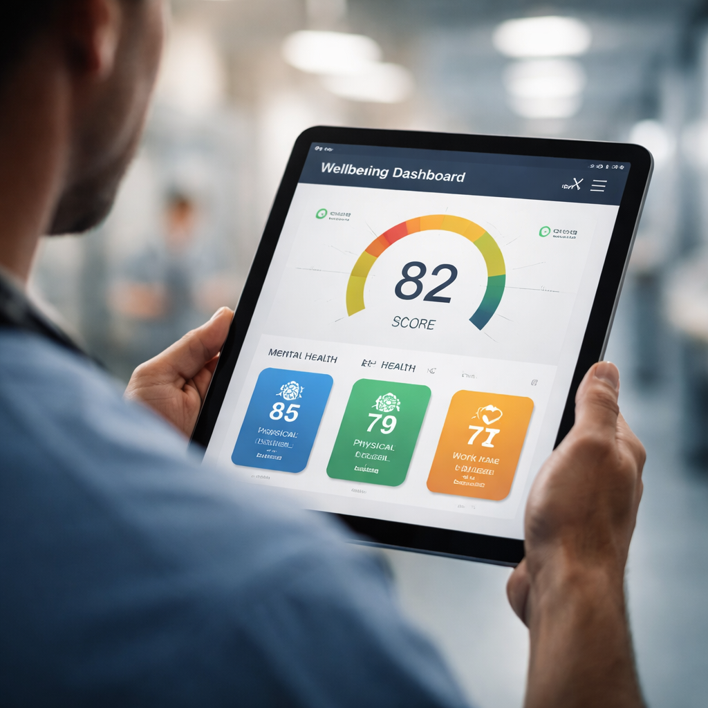
When the raw data comes in, add up the points for each bucket. A higher total in the mental health bucket signals stress, while a high physical fatigue score flags workload issues. You can set simple colour bands, green for low risk, amber for moderate, red for high, to make the score instantly readable. The colour bands let busy managers see risk at a glance during rounds.
Once you have the buckets, pull them together in a single dashboard so leaders can spot trends at a glance. A dashboard lets you compare units, track changes over time, and spot early warning signs before burnout takes hold. See how to build one in our guide to creating a clinician wellbeing dashboard. Regularly updating the dashboard keeps the conversation alive and prevents issues from slipping through the cracks.
Keep the metric sheet simple: a one‑page table with the three bucket scores, the overall total, and the colour band. Share it with department heads in a short email and invite a quick 5‑minute check‑in if the score lands in amber or red. You can also export the table to Excel for deeper trend analysis.
With the metrics defined, you’re ready to move to the next step, turning those numbers into a concrete action plan that helps your staff stay healthy and focused.
Step 2: Collect Data Using Reliable Tools
Now that your questionnaire is ready, you need a way to pull the answers into a clean data set.
Start with a tool that saves responses straight to a spreadsheet or a secure cloud form. Google Forms works well for small teams, while REDCap offers extra privacy for larger hospitals. Both let you set the same Likert scale you built in step 1, so the numbers line up automatically.
Tip: give the form a short, clear title, something like “Clinician Wellbeing Survey – March 2026”. A clear title helps staff find the link fast and keeps the data tidy.
Step‑by‑step setup
1. Open your form builder and create a new questionnaire.
2. Copy each question from your draft, keeping the 5‑point scale.
3. Turn on “Collect email only once” if you want anonymous but unique responses.
4. Set the destination to a Google Sheet or CSV file.
Once the form is live, share the link via the staff intranet, a quick email, or a QR code posted in break rooms. Ask managers to remind teams at the end of each shift.
If you need a more visual dashboard, the e7D‑Wellness platform can pull the CSV file and turn the scores into colour‑coded charts. That way you see green, amber, and red zones at a glance.
When the data starts flowing, run a quick sanity check. Look for any rows that have all “5” answers – that may mean someone left the form blank. Delete or flag those rows before you calculate averages.
Next, calculate the domain scores. In your sheet, add a column for each domain (e.g., emotional exhaustion). Use a simple SUM formula to add the five items in that domain, then divide by the number of items to get an average. The same formula works for the other domains.
Finally, map the averages to the risk bands you set in step 1. You can use an IF statement: if the average ≥ 4.5, mark it red; if it’s between 3 and 4.5, amber; otherwise green. This gives you a ready‑to‑read score for every clinician.
Need help building the dashboard that shows those colours? Check out How to Create a Clinician Wellbeing Dashboard for Hospitals for a template you can copy.
For a fun diversion, the team at Blackbeard Marine shares a guide on picking the right pontoon boat, a neat read if you need a break from spreadsheets: Buying a Pontoon Boat OK .
Event planners often need quick tips too. The Mirror Photo Booth Rental article breaks down seven easy steps to choose a booth that works for any gathering: Mirror Photo Booth Rental: 7 Must‑Know Tips.
Step 3: Score Calculation Methodology
Now that you have clean data, it’s time to turn raw answers into a real score. The goal is to end up with a single number per clinician that tells you whether they’re doing fine, need a check‑in, or are at risk.
First, group the items by the domain you set in step 1 – for example emotional exhaustion, depersonalisation, and personal achievement. In your spreadsheet add a column for each domain.
Calculate the average per domain
Use a simpleAVERAGEformula. If you have five questions for emotional exhaustion in cells B2:B6, the formula looks like=AVERAGE(B2:B6). Do the same for the other domains.
Next, combine the domain averages into an overall wellbeing score. One easy method is to take the mean of the three domain averages:
Domain | Average (1‑5) | Weight |
Emotional Exhaustion | 4.2 | 1 |
Depersonalisation | 3.8 | 1 |
Personal Achievement | 2.9 | 1 |
Sum the three averages and divide by three – that gives you a score between 1 and 5. Higher numbers mean more burnout risk.
Map scores to colour bands
Use anIFstatement to turn the number into a colour. For example:
=IF(C2>=4.5,"Red",IF(C2>=3,"Amber","Green"))
ReplaceC2with the cell that holds the overall score. Red flags clinicians who may need immediate support, amber signals a watch‑list, and green means things look good.
Tip: run a quick filter to spot any rows where every answer is a 5 – that usually means the form was left blank. Delete or flag those rows before you calculate averages.
Need help interpreting what the numbers mean? Check out How to Interpret Results of a Clinician Wellbeing Assessment for a deeper dive.
Finally, lock the sheet so nobody can change the formulas by accident. Save a copy as a read‑only report and share it with unit leads. They can see at a glance which teams need a quick chat, which need a deeper review, and which are thriving.
Step 4: Interpret Results and Take Action
Numbers on a sheet can feel cold, but they’re really a quick pulse check on how your team is holding up.
First, glance at the colour band each clinician lands in. Red means they’re at risk and need a fast check‑in. Amber tells you to keep an eye on them. Green shows they’re doing fine for now.
Tip: run a filter for any scores that sit exactly on the cut‑off lines. Those edge cases often hide hidden stress.
When you spot a red, reach out within 24‑48 hours. A brief, private chat lets you ask how they’re feeling and offer a resource—maybe a short e7D‑Wellness self‑assessment recap or a quick stress‑relief micro‑habit.
For amber scores, set a gentle reminder to revisit the data in a week or two. You might pair the follow‑up with a team‑wide tip, like a 5‑minute breathing break at the start of each shift.
Green scores are your success stories. Share the good news in a staff bulletin or a quick huddle. Letting the team see what’s working builds morale.
Don’t just file the numbers—turn them into a living plan. Create a simple action list for each colour band:
Red: personal check‑in, offer confidential support resources.
Amber: schedule a follow‑up, provide a low‑effort wellbeing tip.
Green: acknowledge the win, ask what helped.
Platforms like e7D‑Wellness make this loop easier by sending automated alerts when a new red pops up, so you never miss a signal.
Need a deeper dive on how the scores are built? Check out the Maslach Burnout Inventory scoring guide for the math behind each domain.
Finally, lock your spreadsheet or dashboard so only authorised eyes can edit formulas. Export a read‑only version for unit leads and keep a backup in a secure folder.
When the data talks, you listen, you act, and you keep the care team thriving.

Conclusion & Next Steps
Pulling together what we’ve covered, you now have a clear picture of how to evaluate clinician wellbeing score—from picking the right metrics to turning raw answers into a colour-coded risk flag.
Start by scheduling a quick audit of your current questionnaire. Compare each item against the five-point Likert scale you set, then run the IF formula we showed to map scores to green, amber, or red.
Once the sheet is locked, share a read-only version with unit leads and ask them to note any red rows for a one-on-one check-in within the week. For deeper guidance on scoring, see the Maslach Burnout Inventory Scoring guide.
Finally, set a recurring reminder, maybe every Friday, to review the dashboard, tweak any wording that feels vague, and celebrate a shift from amber to green. Small, steady moves keep burnout at bay and keep your team thriving.
FAQ
What is a clinician wellbeing score and why should I care?
A clinician wellbeing score is a single number that sums up how a health worker feels at work. It pulls together things like stress, fatigue, and sense of purpose. You care because the score spots risk before it shows up as sick days or turnover. A clear score lets you act early and keep your team healthy. You can track changes over time and see if interventions are working.
How do I choose the right questionnaire for scoring?
Pick a tool that fits your setting and your time budget. Popular options like the Mini-Z or Maslach Burnout Inventory already have proven questions and scoring rules. Make sure the survey is short enough for a busy shift and that it uses a 5-point Likert scale so the numbers line up later. A short pilot with a few staff can reveal any confusing wording before you roll it out.
How can I turn raw survey answers into a numeric score?
First, pull the raw answers into a spreadsheet. Then give each answer a numeric value – for a 5-point scale 1 means “never” and 5 means “always”. Add the numbers for each domain, like emotional exhaustion, and divide by the number of items to get an average. Finally, use a simple IF formula to turn the average into a colour flag. You can copy the same logic for all clinicians so the sheet stays consistent.
What do the colour bands (green, amber, red) actually mean?
Green means the score is low and the clinician looks fine. Amber signals a moderate level, the person might be feeling some strain but not yet at crisis level. Red flags a high risk; the clinician may be close to burnout and needs a quick check-in. Think of the colours as a traffic light that tells you where to focus your support.
How often should I run the wellbeing score assessment?
Run the assessment at a regular cadence that matches your workflow. Many teams pick a quarterly pulse because it captures changes without adding too much burden. If you have a fast-changing unit, a monthly run can catch spikes early. Mark the dates in your calendar and send a brief reminder a day before the link goes live. Review the scores right after each run so you can act while the data is fresh.
What steps can I take after I see a high (red) score?
When a red flag shows up, reach out fast. A short 5-minute chat can reveal what’s pulling the clinician down, workload, shift timing, or lack of support. Offer one concrete help, like adjusting a schedule or sharing a stress-relief tip from the e7D-Wellness portal. Follow up in a week to see if the score moves toward amber or green. Document the conversation so you can track what actions helped most over time.


Comments